

Isis Kenney
Design Strategist
As the Director of Creative and Design, I created a clear and consistent visual style for Digital Harbor Foundation that reflected both the organization’s mission and the interests of its stakeholders.
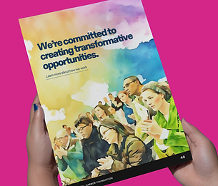
The goal was to blend a nautical theme with a modern tech-focused look to better represent the foundation’s identity as a technology hub, offering resources and access.
Identity & Impact
As the Director of Creative and Design at Digital Harbor Foundation, I collaborated closely with the Executive Director and senior leadership to assess the organization’s evolving brand needs and define a clear direction.
The goal was to create a brand identity that reflects a strong sense of community and incorporates nautical elements that align with the organization’s role as a modern tech hub. Together, we developed a comprehensive brand book that serves as a clear guide for how the organization presents itself across print, digital, and media platforms.
Given the wide range of projects and collaborators involved, I also designed a detailed rollout plan to ensure consistent adoption across teams. This included creating a centralized brand hub with key highlights from the brand book, guidelines for logo and visual identity usage, and a series of explainer videos to make the brand easy to understand and implement for both staff and external partners.
Tailored Reinvention


.png)

Discovery
The discovery phase was essential in reimagining an established organization alongside its stakeholders. While working at Digital Harbor Foundation, I partnered closely with senior leadership and cross-functional teams to understand their needs and define a clear, future-facing vision. The organization sought a refreshed identity rooted in the Baltimore community, incorporating a nautical theme to reflect the harbor while tying in their mission of expanding access to technology and opportunity.
Palette
Color played a central role in reimagining the brand. We aimed for a palette that felt nautical yet modern—anchored in tech, but still vibrant and approachable. Every hue was chosen to reflect the organization’s core mission: community, access, and empowerment. The result is a visual language where each color, document, and image is strong enough to stand on its own while still feeling cohesive across all materials.
Development
Following the discovery phase, I created a comprehensive style guide—an essential tool in redefining the Foundation’s identity. This guide establishes clear standards for visual and verbal communication, ensuring consistency across all digital and print materials.
Identity
Style guides are essential for any organization, providing a cohesive framework—especially when managing multiple projects, marketing initiatives, and outreach efforts.
Execution
In the final phase, we brought the brand to life by using the style guide to build a cohesive brand hub—a centralized resource for both staff and external partners. This hub serves as a practical guide for applying the brand across various touchpoints. It includes a quick-reference cheat sheet, chapter-based explainer videos, and easy-to-use how-to guides designed for professionals on the go.
Impact
The style guide brought clarity and consistency to the Foundation’s communications, helping to showcase their work and partnerships in an engaging, vibrant way. My contributions supported their continued growth.
My Project Planning Journey
